Pride365 is an initiative that promotes year-round support, inclusion, and advocacy for the LGBTQ+ community beyond traditional Pride events
Industry
Events
Service
Mobile Application
The Problem
Pride365 had an incredible mission—keeping the spirit of Pride alive all year long—but their app wasn’t making it easy for people to stay connected. Users struggled to find events in their area, access important community resources, and engage with LGBTQ+ initiatives in a way that felt seamless. The outdated design made navigation frustrating, and without a more intuitive platform, many people weren’t getting the full Pride365 experience. They needed a refreshed app that was easy to use, inviting, and made staying involved effortless.
The Solution
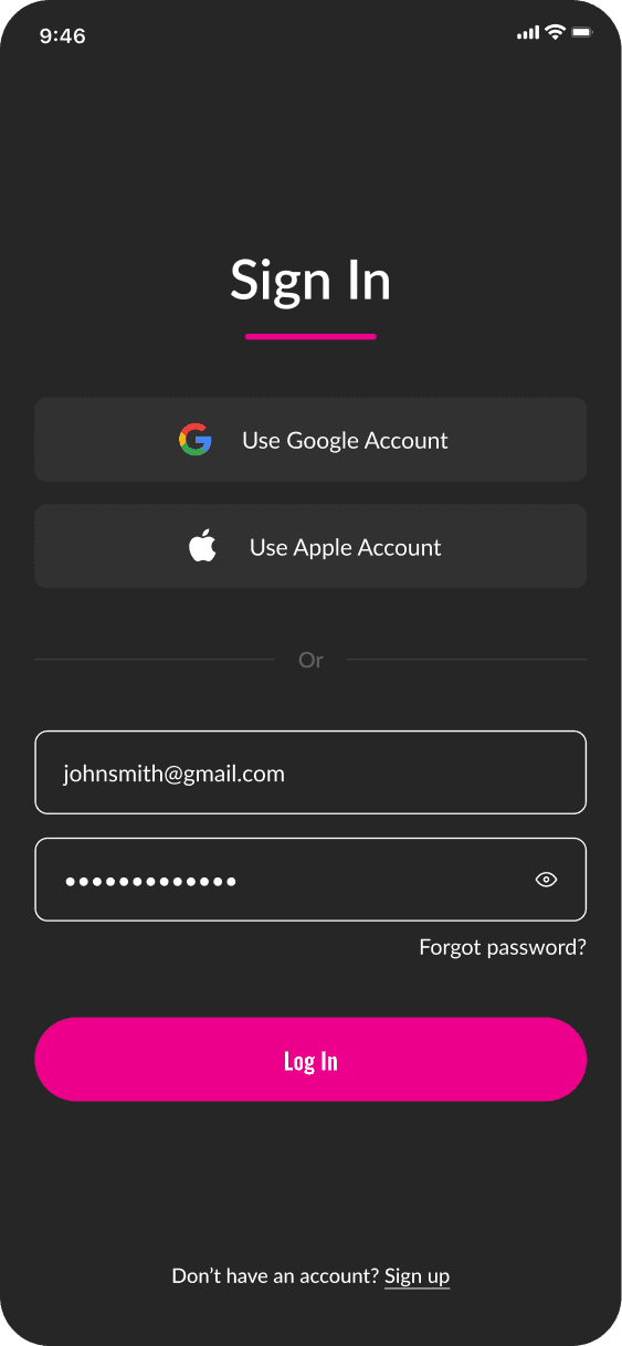
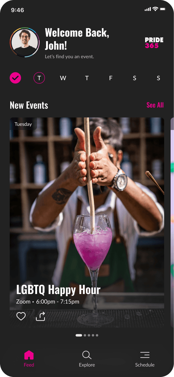
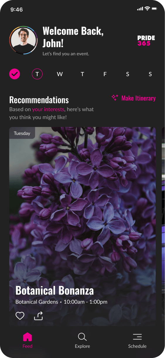
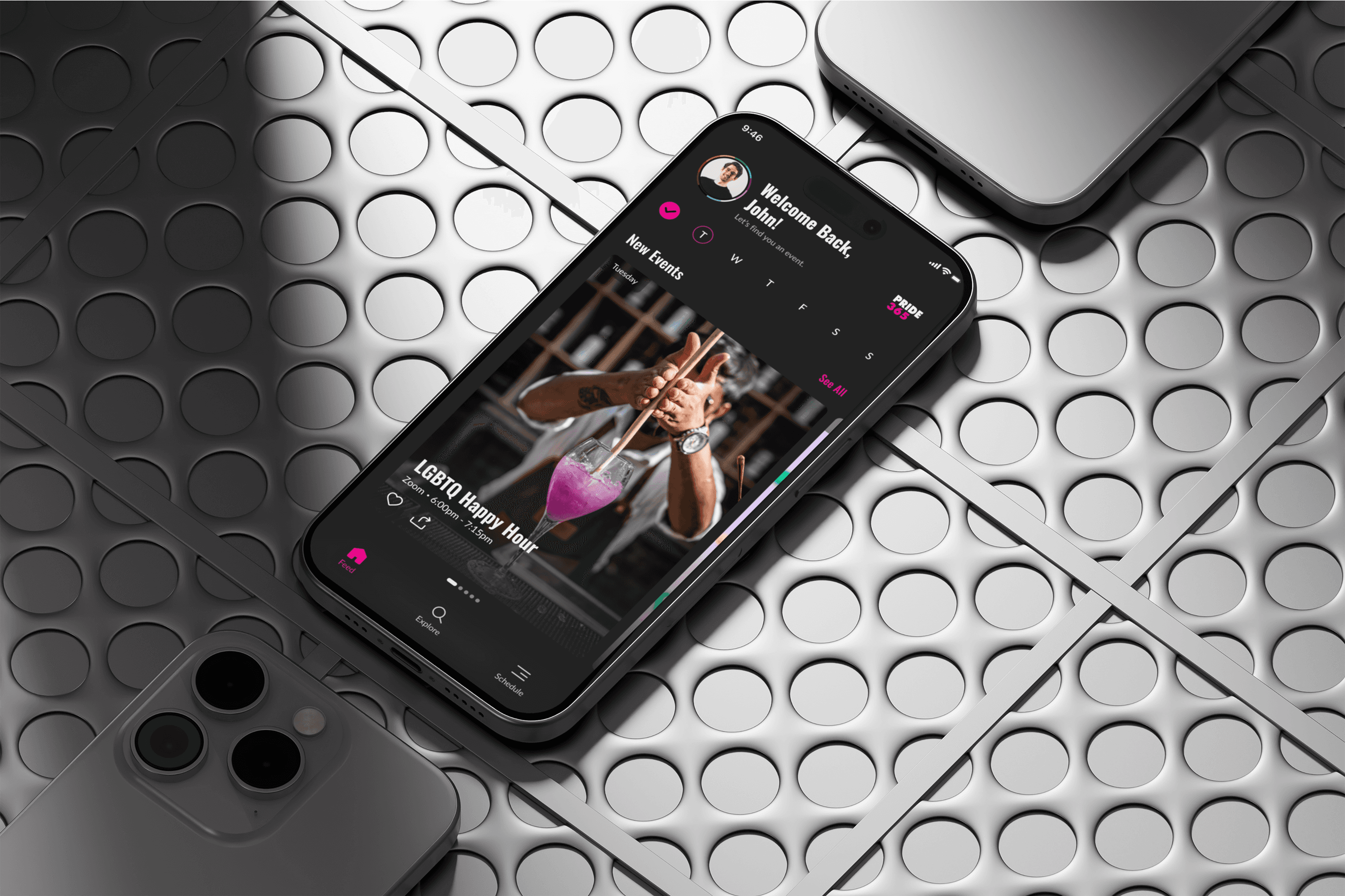
To bring this vision to life, I redesigned the Pride365 app to be more engaging, intuitive, and accessible for everyone. By streamlining navigation and improving event discovery, I made it easy for users to find what’s happening in their community with just a few taps. A modern, welcoming design ensures that people can stay connected, whether they’re looking for events, resources, or ways to support LGBTQ+ initiatives. Now, the Pride365 app truly reflects its mission—keeping Pride going all year long, in a way that feels simple, exciting, and meaningful.
The Design Process
The design process guided research, solution exploration, and refinement. Testing informed an intuitive interface, leading to detailed prototypes for development.
Discover
Conduct in-depth user research to identify pain points, needs, and opportunities for improvement across the user journey.
Define
Analyze the research insights to clearly define the problem, set measurable goals, and outline the scope for the solution.
Develop
Create and iterate on prototypes, incorporating feedback from testing and stakeholders to refine design concepts.
Deliver
Finalize the design, conduct thorough testing to ensure quality, and prepare the product for handoff to development.
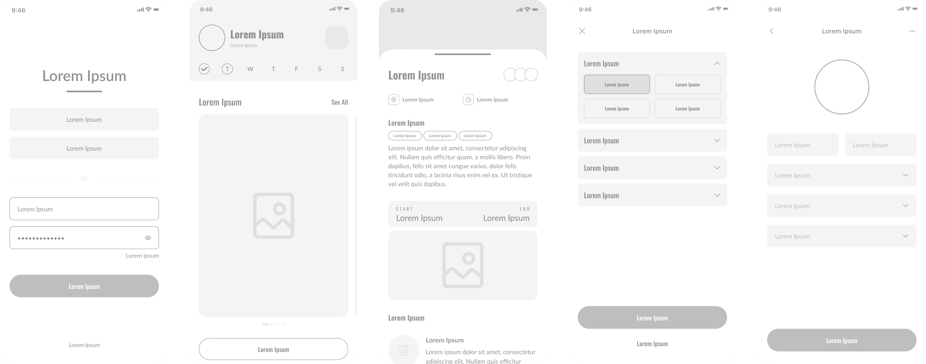
Mid Fidelity Wireframes
Mid-fidelity wireframes define structure, flow, and key interactions, refining navigation and hierarchy before high-fidelity design.
Colors, Typography & Design System
Colors and typography create hierarchy, readability, and brand identity. A balanced palette directs focus, while typography ensures clarity and consistency. The design system ensures consistency and efficiency by providing reusable components, styles, and guidelines. It streamlines collaboration, maintains visual consistency, and simplifies updates across the project.
#262626
#EC008B
#FFFFFF
Continue
Continue
Continue
Continue
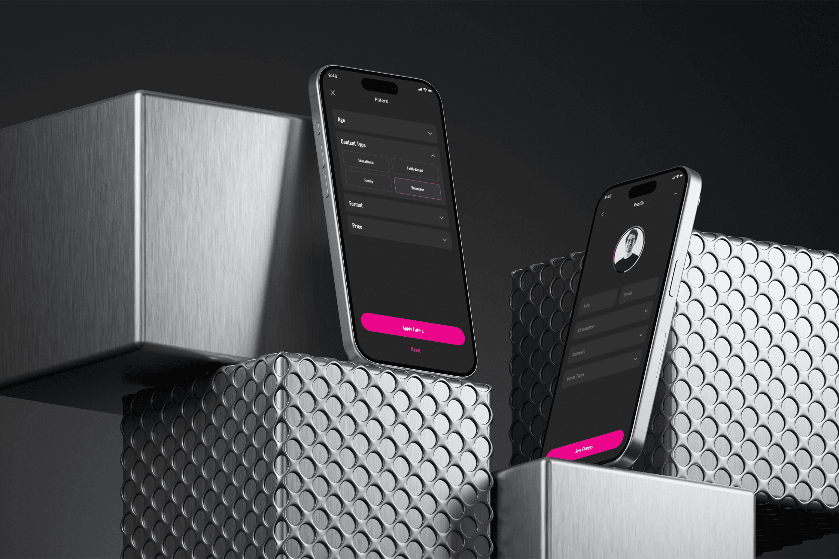
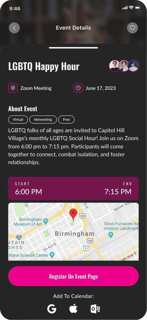
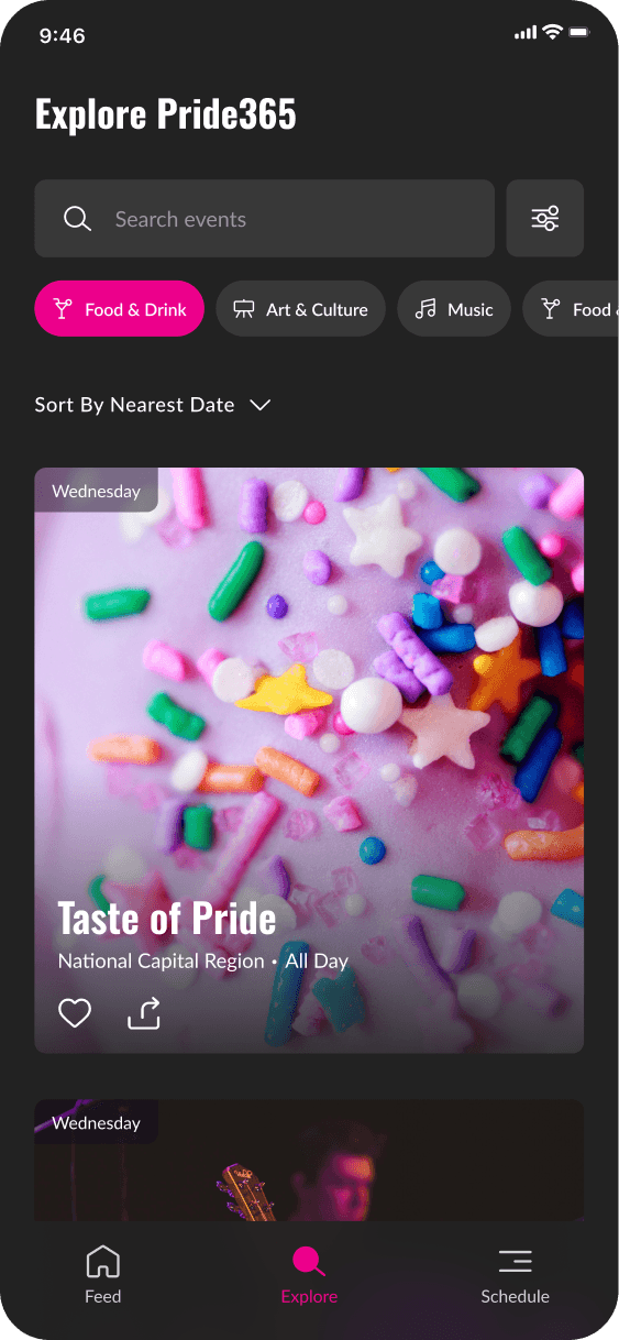
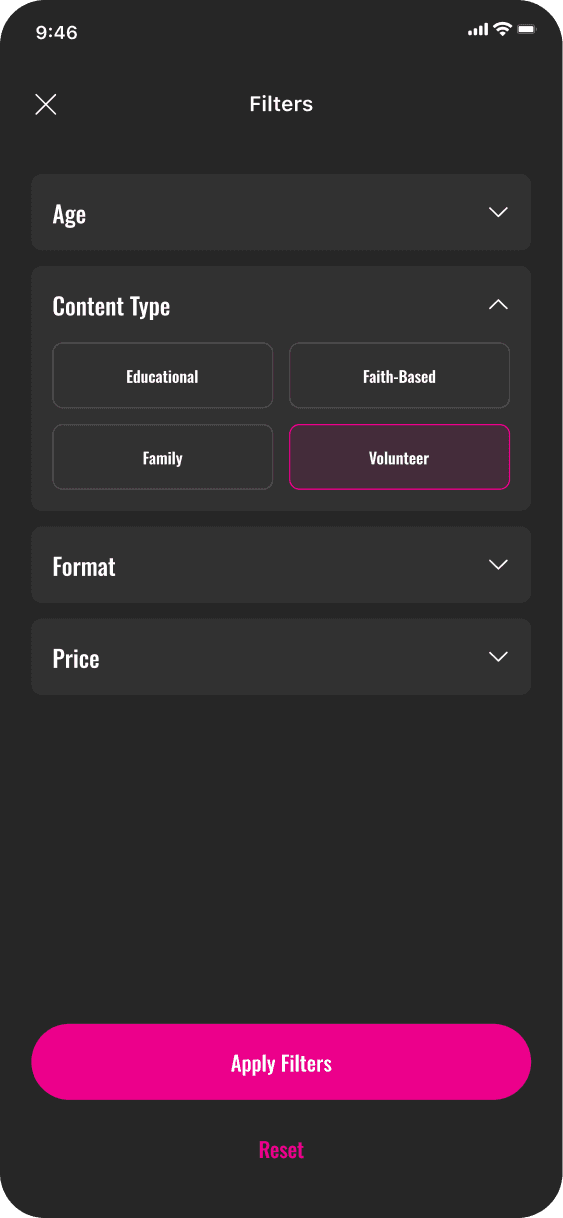
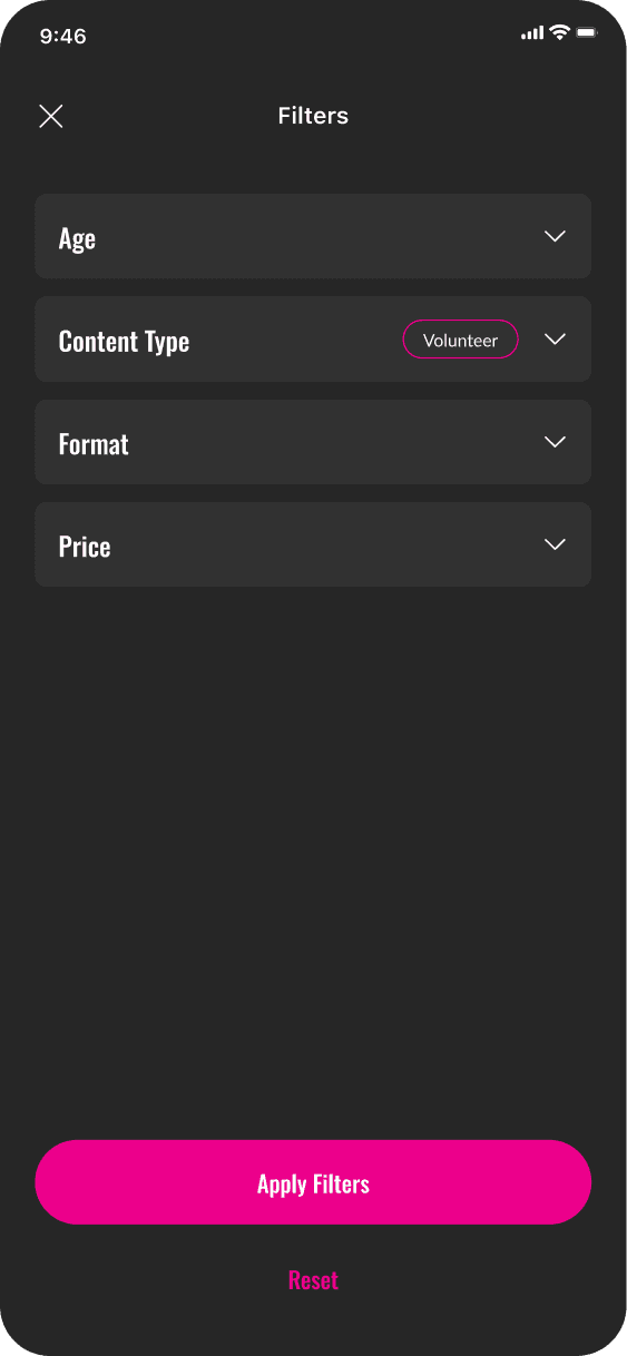
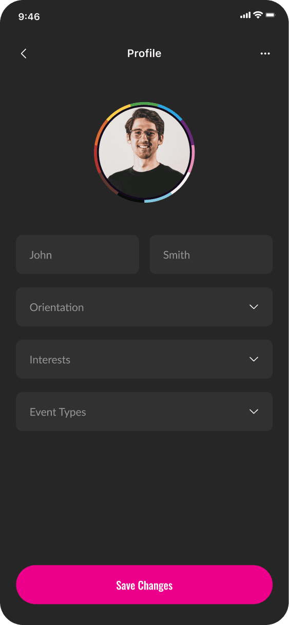
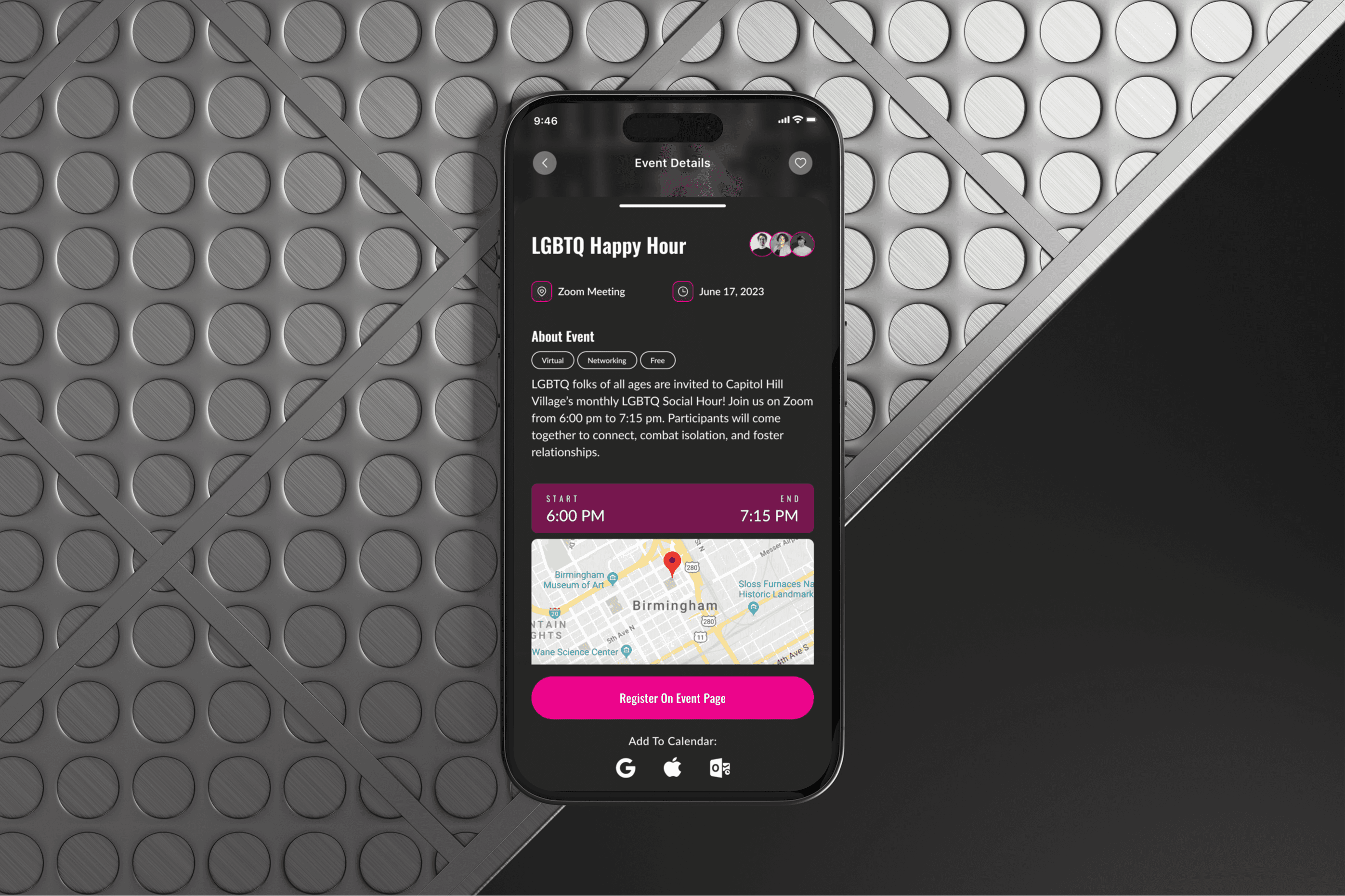
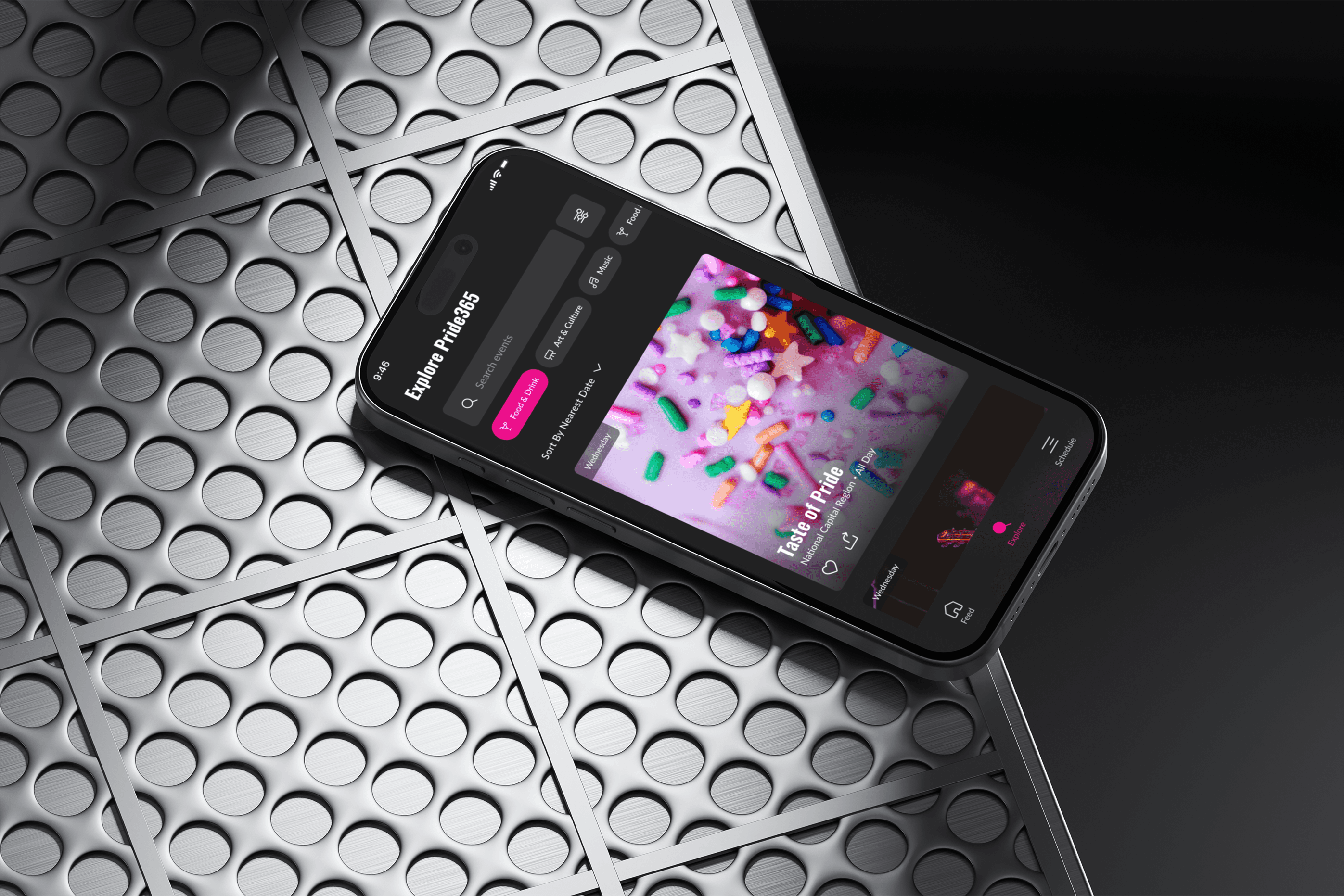
UI Design
Final high-fidelity designs showcase the polished, detailed version of a project, with refined visuals, typography, and spacing. They offer a realistic preview, guiding development while maintaining the intended user experience and brand identity.